OBJECTIVE: In November 2025, Window Nation began preparations for a new market launch scheduled for February 2026. The expansion targeted three distinct regions: North Jersey, Westchester County, and Long Island. The goal of the launch campaign was to introduce Window Nation to these markets while differentiating the brand from established competitors.
IDENTIFYING OBSTACLES: A key challenge of this campaign was the significant cultural and regional differences across the three markets. Creating a cohesive, unifying campaign that resonated with each location—while still maintaining a consistent brand identity—required a thoughtful and flexible approach.
ROLES AND RESPONSIBILITIES: I served as the lead designer, working closely with a copywriter throughout the project. Together, we conducted research, brainstormed campaign concepts, and presented ideas to the Creative Manager and Creative Director. Once a direction was approved, I developed campaign assets across multiple channels, including paid social, organic social (pre- and post-launch), email marketing, and out-of-home placements.
TOOLS: Wrike, Adobe Illustrator, Adobe Photoshop, Adobe After Effects, Blender 3D, Adobe XD.
DURATION: 3 months.
PROCESS: The project began with in-depth research. We compiled market data provided by the analytics team and supplemented it with independent research from online forums, social media platforms, blogs, and government websites. This allowed us to better understand consumer behaviors, values, and cultural nuances within each market. Using these insights, we brainstormed potential campaign themes and evaluated whether each idea could scale and translate effectively across all regions.
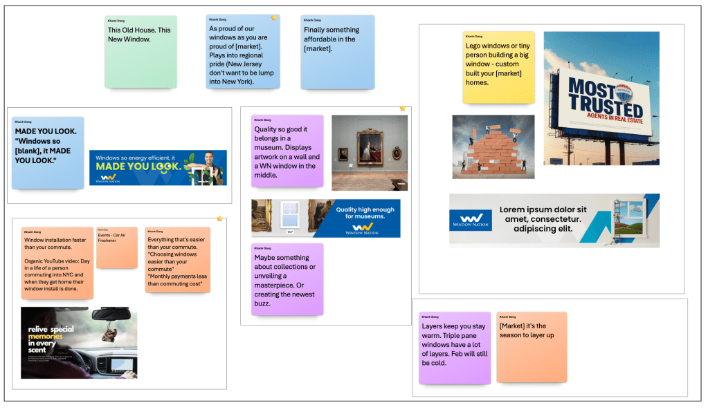
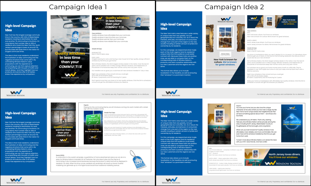
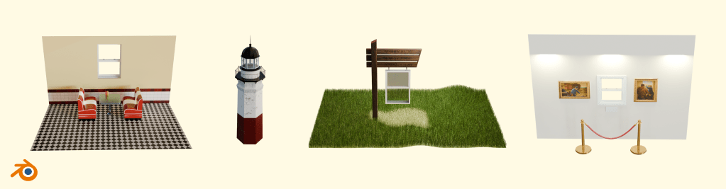
PROCESS (Cont.): We ultimately pitched our two strongest concepts, expanding on each to better communicate the vision and execution. After review, we were directed to move forward with the second concept. To quickly visualize the idea, I initially used stock photography and AI-generated imagery to create early mockups. Once the direction was clearly defined, I rebuilt the creative using custom 3D models, which allowed for greater control over the scenes and a more accurate representation of my vision.
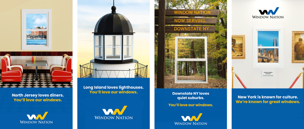
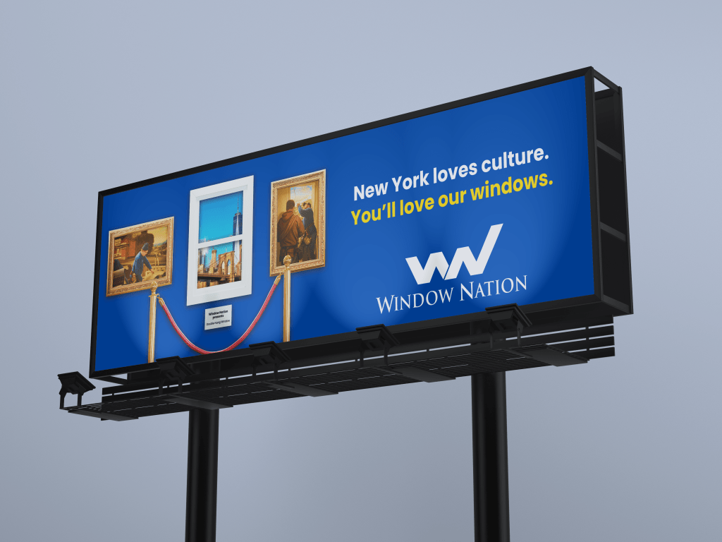
The concept originated from the belief that our windows are masterpieces—and masterpieces belong in museums. In New York City, museums are not only cultural institutions but an essential part of the city’s creative identity. That connection inspired us to align our brand with a defining cultural hallmark of each market we serve.
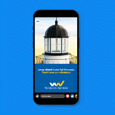
In Long Island, we drew inspiration from its iconic lighthouses; in New Jersey, from its classic diners; and in Westchester County, from its quintessential suburban landscape. By identifying and embracing these distinctive regional symbols, we were able to seamlessly connect each market’s cultural character to the core value proposition of our windows—craftsmanship, durability, and timeless design.
ITERATIONS: Feedback throughout the process was minimal but impactful, helping refine the work. One notable example was the lighthouse creative for the Long Island market. In early iterations, the double-hung windows on the lighthouse were not immediately recognizable. While the distinction was clear to me, feedback highlighted the importance of making this feature instantly readable for consumers, leading to adjustments that improved clarity.

THE FINAL PRODUCT: Final assets were delivered approximately one month after the initial research phase, allowing ample time to further develop organic social content and additional launch materials ahead of the campaign rollout.
LESSONS LEARNED: One key takeaway from this project was the importance of adapting creative assets based on the medium—digital versus out-of-home—while maintaining visual cohesion. For example, the North Jersey diner creative featured a yellow wall in digital executions to represent the retro aesthetic. However, that color did not translate well to billboard formats, so it was adjusted to the brand’s blue while preserving the overall look and feel of the campaign.

RESULTS: During the first week of the launch, the paid ads achieved an average click-through rate of 6.2%—approximately 1,200% higher than prior top-performing evergreen paid ads—while delivering a $54 cost per lead, representing a 205% reduction compared to the evergreen benchmark.
TAKEAWAYS: This campaign allows me to push my creative work by incorporating more 3D modeling and tailoring concepts to each market, while still maintaining a cohesive, singular campaign. Consumers also appear more receptive to messaging and imagery that reflect their local context and connect directly to our product and service offering, which provides valuable insight for shaping future campaigns.
